What this means is that we have to paint in brighter shades than the real thing to get the same look! If you want to see this in reality buy a tester pot of household paint in a fairly bright colour, lets say red and a piece of white card. Paint the card in the paint and also paint a figure in the same colour (ideally undercoat that in white so you are comparing like with like). Next on a a reasonably nice day with good even daylight go outside and have someone hold the card against their chest and walk away until they are about the size of the figure at arms length and compare the two colours. The card should look brighter. Oh and be prepared for some strange looks if you do this in the street!
To help the figure stand out on the table I usually look for the things that make a figure 'pop'. Usually that's headgear, faces and especially shields for ancient period figures. I paint shields and metallics last and with shields will go back over the original ink washed primer in white to help the finished shield stand out.
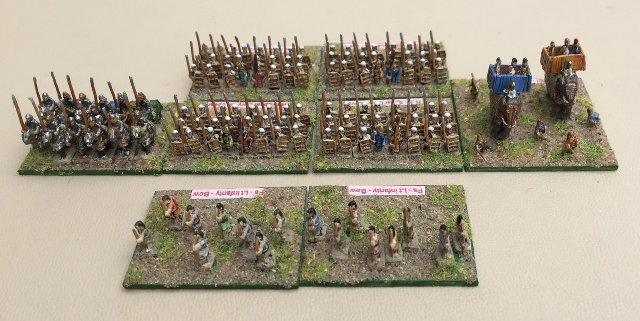 |
| See how those white hats pop out at you? |
Before we start - more preparation
To make sure that the paint is going to cover and give the depth of colour you are going to want I add a small stainless steel ball bearing into each of my dropper bottles of paint to help the pigment and medium mix together when I shake them up. You can by them from some of the paint manufacturers but its cheaper to buy from engineering suppliers on line. Just make certain they really are stainless steel, you don't want them going rusty and ruining your paint. I put a couple of drops of paint onto my palette (Palette, who am I trying to kid its an old coffee jar lid). Don't forget to close the paint container as it dries out quickly if you don't.
 |
| You don’t need a palette when coffee jar lids are free |
As an aside, I have tried wet palettes but can't get to grips with the them. They are intended to keep paint wet so you don't have to remix a colour you have blended each session. I only paint in small batches so I make up the colour I want for each batch. As I'm painting troops who were wearing civilian clothing I don't want too much uniformity any way, so variation between batches of paint is a good thing!
Brushmanship
Don't overload your brush which means don't dip the entire brush into the paint, about a half to a third of the brush with paint is good. To much paint means less control over where the paint goes as it delivers too much paint on the first stroke. Too little is better than too much until you get a feel for what you are comfortable with. Don't forget to thoroughly clean the brush if you change colour either. That is easier if you haven't overloaded as less paint gets down into the base of the brush. Thats something to avoid as dried paint at the point where the hair is joining the handle makes the hair splay out and you will loose the point making the brush no use for detail. Don't throw it out though as it will still be good for dry brushing or varnishing. This may seem obvious but pull the brush don't push it, you want the paint to flow down the hair of the brush and flow off the point onto the casting. Try to avoid dabbing at the model with the brush for the same reason, if you do need to do that to create a specific effect use a stiff brush with short hair.
Time to paint
The fastest way to get figures ready for the table is to paint block colours and then ink wash them. Once you have more experience then you can add embellishments like dry brushing highlights and picking out fine detail.
Figures are sculpted with an eye to helping you to achieve a decent paint job. The sculptor does that by creating well defined edges to items of clothing and equipment so they act like a guide to let the paint go where you want it. You need to learn to work with the edges the casting defines for you.
Start with the base which I do in Vallejo Khaki as it is a similar colour to my basing sand. Then move to the large areas of clothing usually from top layer towards the lowest, so tunics before trousers as the sculpted edges help more that way around. Once you learn brush control you can ignore this rule but for now it is helps. Flesh, hair, bags, other equipment and weapons are next. On these figures the javelins are sculpted touching the body so just a line of paint on the top and side is enough to define the spear shaft. Because feet disappear into the basing I often leave those or just give a touch of the shoe colour. High boots do get painted though as they will show up. Once everything is painted and dry the next step is a coat of varnish.
 |
| Tunics and trousers done, see how the primer impacts on the top coat |
 |
| Ready for the varnish #1 |
 |
| Ready for the Varnish #2 |
I use a satin acrylic varnish as it gives a smooth finish for the next stage which is the ink wash. Ensuring the varnish is dry I give a wash of GW Agrax Earthshade for shading and keep the figures upside down until that dries so the ink pools on the bottom of folds etc. Its a kind of zenithal shading on the cheap. Agrax Earthshade creates a nice brown shading effect than also matts down the satin varnish. Lastly I repaint anything I want to be really bright first in white than in the actual colours I want. For me as I'm painting pre gunpowder era figures this includes shields and flags and banners. Very last is to do all the metallics; spear points helmets and bright plate armour (the really shiny silver looking stuff hollywood seems to love). I tend to do most other metal body and horse armour when I do clothing and let the ink wash pick out the details.
 |
| The shields create a focal point to draw the eye |
 |
| Shaded with a black ink over gloss varnish. It’s too stark and too shiny! |
 |
| Satin varnish but with Agrax Earthshade as a wash. See how it kills the shine and is less stark. |
 |
| Resurrected after the highlight error and with shields ready to be painted. |
I have been deliberately vague about the details of painting figures as this is a skill you will learn by doing and mistakes don't show up that much on a 6mm casting once they all based in groups. Practice and you will quickly learn what works for you and before long you will have a style you are comfortable with.
Highlighting and detailing
The next skill to learn is an optional one, highlighting. Personally I very rarely do this on 6mm figures. If you want to experiment one way to do it is by a light dry brushing. Use an older brush as this technique is rough on the hairs and don't thin the highlight colour use it straight from the bottle or pot. Put a very small amount of paint on the brush and wipe the brush against a cloth. A slightly larger brush than used for the main painting say a size 1 or 2 is a good choice. Test on your thumbnail by gently drawing the brush across it, paint should only be left on the raised parts of the nail. Then wipe it on the cloth again! Test on your thumb nail again until it hardly leaves a mark. When you get to that point do the same across the figure running from the head and shoulders down towards the feet. Better to have to do three or four passes leaving almost no highlight than one pass which is too heavy, as I have just done on the demonstration figures for this post! Nothing a quick reprime and new paint job won't solve. The highlight shade needs to be a good deal lighter than the base shade other wise the effect is lost at table distances.
I can tell what you are thinking at this stage ....how on earth do I individually highlight each different item of clothing separately to all of the others, each one is a different colour! The answer is you don't. Try a neutral light shade such as a very pale sand or beige across all of the clothing and bags etc. By using a very fine dry brushing and building it up you should leave just enough of the main colour showing to disguise the fact that all of the highlight is the same colour. Or like me you can just do without!
Detailing is the last thing I do. For my figures this is mostly shield patterns. I use artists permanent fineliners and disposable drawing pens to produce lines under 1 mm in thickness. The Pilot drawing pens are particularly good for this although they only come in black or sepia. For colour I use Staedler triplus fineliners with a 1mm nib, you will need to take care with these though as they are not permanent and varnish applied over the ink will smear the pattern so they are the very last step in my process. I have tried acrylic paint pens but don't like the results as they tend to blot. I have read about some refillable pens made by Liquitex that give better results but haven't tried these out yet. As an example the patterns on the Anglo-Saxon Foot pictured earlier were done using pens. Sometimes I use a pen to mark out a belt but usually I leave it. Check out the third of the three varnished groups above, can you really notice the lack of painted belts? The wash settles either side of any belt on the casting which for me is more than enough.
My error with the highlighting stresses another point, "more haste, less speed". These figures don't take long to do even if you are taking a lot of care over the painting. There is nothing to gain from rushing. Speed will come with practice. At this stage if you can't paint well slowly, you definitely can't paint well fast. Slow down and aim for the best quality result you can achieve.
More on mixing and blending colours
A couple of suggestions on blending colours, if you want a red to seem richer add the tiniest drop of blue to the red. The same works in reverse for blue just add add a tiny amount of red. A small bit of yellow added to a green makes it seem fresher. As you get your eye in you begin to realise that a colour has hints of other colours within the range of shades of that tone. So for example blue can be more towards the green or towards the purple end of the range. I suggest that you search online art sites for 'colour wheel' and 'colour theory' to help explain this. This is a site I found just a single google search away, Colour Theory Artists have been doing this stuff a long time and have learned a lot along the way that we can adapt for miniatures so it makes sense to piggyback off their techniques.
Darkening and lightening colours is never as simple as just adding white or black. Often adding a brown or a blue works better always depending on the base colour. I'm told but have never tried it that a good colour for highlighting black is mid green! Don't be afraid to experiment. The failures can always be painted over and hidden in the middle of a unit!
Where do you paint?
Somewhere with a bit of elbow room and good light (or space for good artificial light with a daylight bulb, especially if you are going to paint in the evenings) should be your objective. Ideally a permanent painting station is best as you can just sit down and get stuck in without loosing painting time in setting up and putting away. Space to sit part painted figures to dry is useful. I batch paint so I may have 70-80 figures on the go at once so there is a production line going. For dark age warriors I might have four strips of Baccus infantry on a stick (so 24 figures) but because I want variety I will mix a colour and do lets say, five tunics and two trousers on one stick then four trousers and three tunics on the next until some figures on each stick have that colour. Then clean brush, new colour and round I go again. That means I have to be able to set sticks to one side while I work on the next one.
 |
| My painting station -it doesn't have to be a huge space. My table is 56cm square but with space to stack things around it. |
So there you have it, all that is left now is to set up your painting area and start painting. This is a skill where the 10,000 hour rule really does apply. Spend 10,000 hours at doing anything and by hour 10,001 you will be really good at it. Above all enjoy the experience your 10,000 hours starts now!.
Post Script
The highlighting disaster wasn't actually that bad when I looked at it the following day. I was able to correct the worst of the problem by repainting the hair and using the Baccus 'dot & dash' painting technique (which you can find here How to paint 6mm figures) over the highlighted areas on the torso using the original tunic colour. A further coat of varnish and a new ink wash did the rest. Which goes to show that almost every painting error can be fixed without too much trouble.
Edited to correct some typing errors and added a couple of words here and there to make things a little clearer and add missing points.
No comments:
Post a Comment